The “Sales statistics” page provides insights into sales figures and offers a visualization of sales data over a defined period of time. It can be accessed in two ways:
- SELLERLOGIC Homepage > Repricer | Sales statistics
- Repricer navigation bar > Sales statistics
Page components
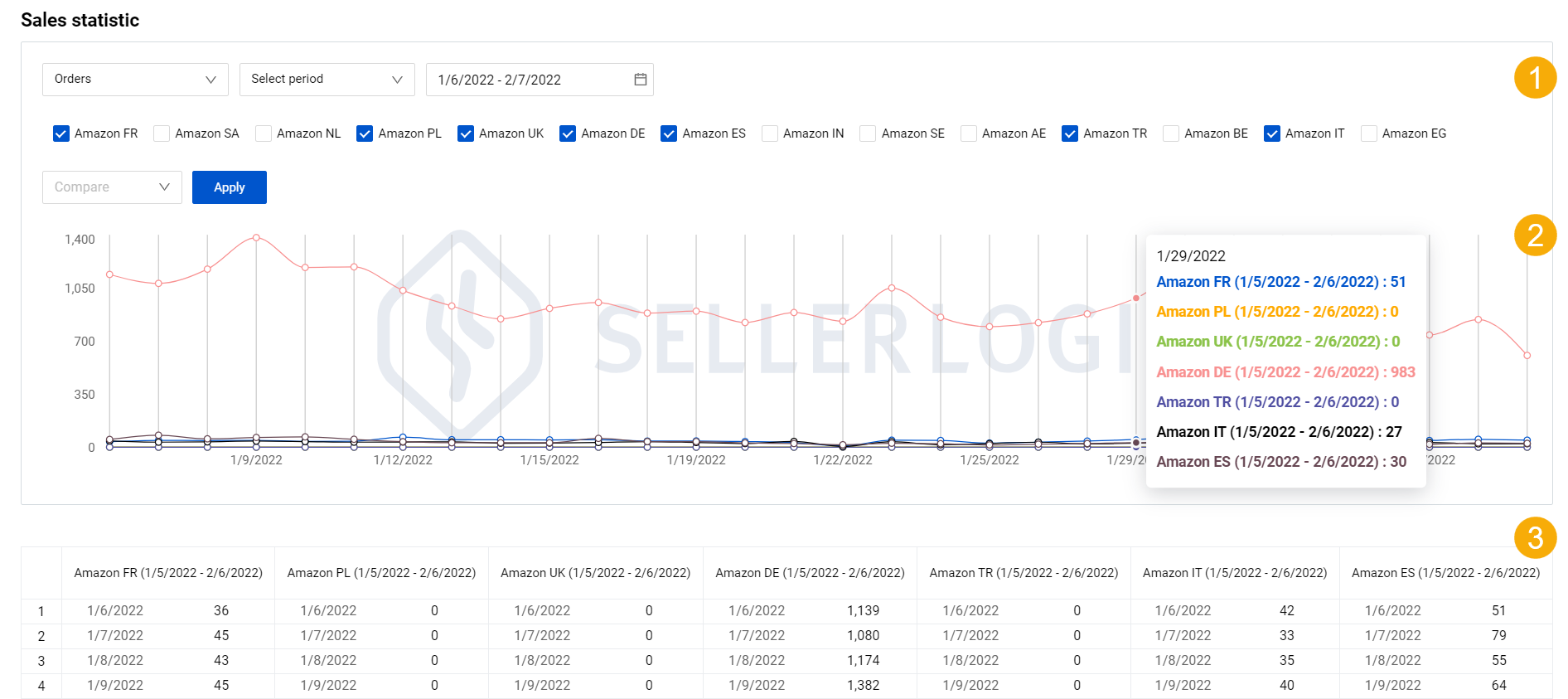
1. Statistics filters
They allow you to customize the displayed data by selecting specific parameters such as metrics type, period selection, or marketplaces.
Metrics filter allows selecting a certain type of data (vertical, Y-axis) which can be one of the following:
- “Orders”: the number of sales orders dynamics;
- "Revenue": the generated revenue dynamics;
- “Profit”: the dynamics of the generated net profit based on the current selling price;
- "Ø Selling price": the average selling product price dynamics;
- “Ø Products per order”: – the dynamics of the average number of products per order.
Period selection allows you to specify a desired time period (horizontal, X-axis) which can be one of the following:
- “Previous”: Choose the period type – “Day” or “Months” and its number counted backward from today. Note: You can select up to 100 days/months.
- "Select month": Choose the particular month and the year.
- “Select period”: Choose the custom period.
Marketplaces filter shows all marketplaces that are connected to Repricer. You can check/uncheck specific marketplaces to be included/excluded from the sales statistics analysis. Each marketplace has its corresponding line on the chart.
2. Chart
It visualizes sales performance displaying the sales data as a continuous line, representing the changes in metrics over time. The vertical Y-axis of the chart represents the selected metrics, while the horizontal X-axis displays the time period.
By hovering over the days represented as period dots, you can access detailed statistics for the day in terms of selected marketplaces. Each marketplace has its own unique color that corresponds to the color of the statistics line on the chart.
3. Table
It shows sales data in a table, offering a daily overview of the metrics per each marketplace. The table header shows the name of the marketplace and the selected period. The bottom line of the table displays the total sum per selected metric.
Comparison
The “Sales statistics” page provides a comparison function that allows you to compare data for the chosen period with another period. To use the comparison:
1. Select “Yes” in the “Compare” field located next to the statistics filters;
2. Specify the previous period for comparison:
- “Same period” – the same duration as specified within the page settings. You can select up to 12 periods of this type for comparison from the numerical dropdown list;
- “By Months” – the same duration as specified within the page settings in terms of months. You can select up to 12 months for comparison from the numerical dropdown list.
3. Click “Apply” and the page will update to show the sales dynamics for each marketplace and the compared period represented by different color lines.
Examples
Here are a few examples to illustrate how the comparison settings in the “Sales statistics” page work:
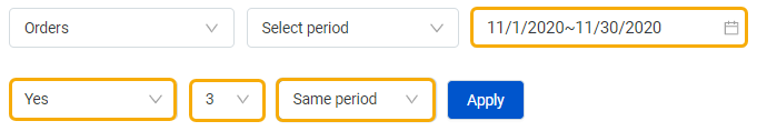
Period selection: 1-30 November 2020 (30 days)
Compare: three previous periods of the same duration
The following periods will be compared:
- Defined period: 1-30 November 2020 (30 days)
- First period: 2-31 October 2020 (30 days)
- Second period: 2 September-1 October 2020 (30 days)
- Third period: 3 August-1 September 2020 (30 days)
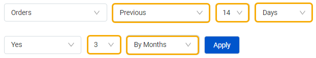
Period selection: previous 14 days
Compare: three previous periods by months
Current date: 23 September 2023
The following periods will be compared:
- Defined period: 9-22 September 2023 (14 days)
- First period: 9-22 August 2023 (14 days)
- Second period: 9-22 July 2023 (14 days)
- Third period: 9-22 June 2023 (14 days)